Flutter学习记录——10.导航组件
文章目录
- 1.TabBar和TabBarView Widget
- 2.BottomNavigationBar Widget
- 3.CupertinoTabBar和PageView Widget
- 4.BottomAppBar Widget
- 5.总结
1.TabBar和TabBarView Widget
TabBar 和 TabBarView 一般是搭配使用,TabBar 用来实现 Tab 导航部分,TabBarView 用来实现 body 内容区域部分。TabBar 继承自 StatefulWidget,是一个有状态组件。TabBarView 同样也是继承自 StatefulWidget。
来看下 TabBar 的构造方法:
const TabBar({Key key,// tab页Widget集合,可以使用Tab组件或者其他组件@required this.tabs,// TabController对象,控制tab页this.controller,// 是否可滚动this.isScrollable = false,// 指示器颜色this.indicatorColor,// 指示器高度this.indicatorWeight = 2.0,// 底部指示器的Paddingthis.indicatorPadding = EdgeInsets.zero,// 指示器装饰器decoration,例如加边框this.indicator,// 指示器大小计算方式,TabBarIndicatorSize.label跟文字等宽,TabBarIndicatorSize.tab跟每个tab等宽this.indicatorSize,// 选中Tab文字颜色this.labelColor,// 选中Tab文字Stylethis.labelStyle,// 每个label的padding值this.labelPadding,// 未选中label颜色this.unselectedLabelColor,// 未选中label的Stylethis.unselectedLabelStyle,this.dragStartBehavior = DragStartBehavior.down,// 点击事件this.onTap,})
再看下 TabBarVeiw 构造方法:
const TabBarView({Key key,// tab内容页列表,和TabBar的tab数量一样@required this.children,// TabController对象,控制tab页this.controller,this.physics,this.dragStartBehavior = DragStartBehavior.down,})
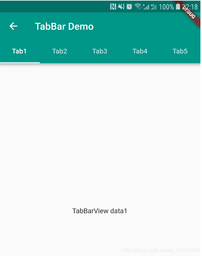
我们看一个 TabBar 和 TabBarView 结合的实例:
// TabBar和TabBarView最简单的用法class TabBarSamplesState extends State<TabBarSamples>with SingleTickerProviderStateMixin {TabController _tabController;@overridevoid initState() {super.initState();//initialIndex为初始选中第几个,length为数量_tabController = TabController(initialIndex: 0, length: 5, vsync: this);// 监听_tabController.addListener(() {switch (_tabController.index) {case 0:break;case 1:break;}});}@overrideWidget build(BuildContext context) {return Scaffold(appBar: AppBar(title: Text('TabBar Demo'),primary: true,// 设置TabBarbottom: TabBar(controller: _tabController,tabs: <Widget>[Tab(text: "Tab1",),Tab(text: "Tab2",),Tab(text: "Tab3",),Tab(text: "Tab4",),Tab(text: "Tab5",),],),),// body用TabBarViewbody: TabBarView(controller: _tabController,children: <Widget>[Center(child: Text("TabBarView data1"),),Center(child: Text("TabBarView data2"),),Center(child: Text("TabBarView data3"),),Center(child: Text("TabBarView data4"),),Center(child: Text("TabBarView data5"),),],),);}@overridevoid dispose() {super.dispose();_tabController.dispose();}}
运行效果如图:
当然把 TabBar 放在底部也可以,不过一般放在顶部,放在底部的导航效果用另外一种组件,我们接下来将会学到。
如果想放在底部可以这样设置:
// 最外层是Scaffold布局bottomNavigationBar: Material(color: Colors.blue,child: TabBar(controller: _controller,tabs: <Tab>[Tab(text: "Home", icon: Icon(Icons.home)),Tab(text: "Apps", icon: Icon(Icons.list)),Tab(text: "Center", icon: Icon(Icons.message)),],indicatorWeight: 0.1,),),
2.BottomNavigationBar Widget
BottomNavigationBar 一般用来实现底部导航效果,和 Android 原生效果基本一样。
BottomNavigationBar 继承自 StatefulWidget,一般搭配 BottomNavigationBarItem 进行使用。
我们看下 BottomNavigationBar 实现的效果:
BottomNavigationBar 实现的导航有一个特点就是选中项会稍微有一个放大的动画,这是和其他组件实现的导航效果的一个小差别。
BottomNavigationBar 的构造方法:
BottomNavigationBar({Key key,// BottomNavigationBarItem集合@required this.items,this.onTap,// 当前选中位置this.currentIndex = 0,// 设置显示的模式BottomNavigationBarType type,// 主题色this.fixedColor,// 图标尺寸this.iconSize = 24.0,})
BottomNavigationBarItem 的构造方法:
const BottomNavigationBarItem({// 图标@required this.icon,// 文字this.title,// 选中图标Widget activeIcon,// 背景色this.backgroundColor,})
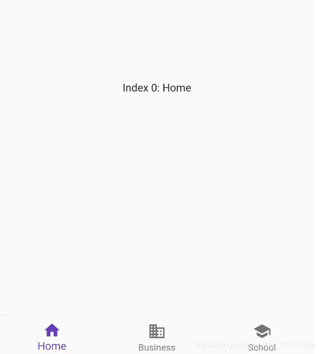
接下来我们通过代码来实现上面的 BottomNavigationBar 的效果:
class NavigationBarState extends State<NavigationBarSamples> {// 默认选中第一项int _selectedIndex = 0;final _widgetOptions = [Text('Index 0: Home'),Text('Index 1: Business'),Text('Index 2: School'),];@overrideWidget build(BuildContext context) {return Scaffold(appBar: AppBar(title: Text('BottomNavigationBar Demo'),),// 主体内容body: Center(child: _widgetOptions.elementAt(_selectedIndex),),// 底部BottomNavigationBarbottomNavigationBar: BottomNavigationBar(items: <BottomNavigationBarItem>[// 单个BottomNavigationBarItemBottomNavigationBarItem(icon: Icon(Icons.home), title: Text('Home')),BottomNavigationBarItem(icon: Icon(Icons.business), title: Text('Business')),BottomNavigationBarItem(icon: Icon(Icons.school), title: Text('School')),],// 选中位置currentIndex: _selectedIndex,// 主题色fixedColor: Colors.deepPurple,// 点击onTap: _onItemTapped,),);}void _onItemTapped(int index) {setState(() {_selectedIndex = index;});}}
可以得到上面效果图所示的运行效果。
3.CupertinoTabBar和PageView Widget
想实现 Android 上类似于 ViewPager 和 TabBar 的导航效果的,也可以使用 CupertinoTabBar 配合PageView 进行实现。这也是一种实现底部导航切换页面的一种方式。
我们看下 CupertinoTabBar 实现的效果:
CupertinoTabBar 继承自 StatelessWidget,PageView 继承自 StatefulWidget。
我们先看下 CupertinoTabBar 的构造方法:
CupertinoTabBar({Key key,// 导航项@required this.items,this.onTap,this.currentIndex = 0,this.backgroundColor,// 选中色this.activeColor,// 未选中色this.inactiveColor = CupertinoColors.inactiveGray,this.iconSize = 30.0,// 边框this.border = const Border(top: BorderSide(color: _kDefaultTabBarBorderColor,width: 0.0, // One physical pixel.style: BorderStyle.solid,),),})
再看下 PageView 的构造方法:
PageView({Key key,// 滚动方向this.scrollDirection = Axis.horizontal,this.reverse = false,// PageController页面控制PageController controller,// 滚动的动画效果this.physics,this.pageSnapping = true,// 页面改变监听this.onPageChanged,// 子元素List<Widget> children = const <Widget>[],this.dragStartBehavior = DragStartBehavior.down,})
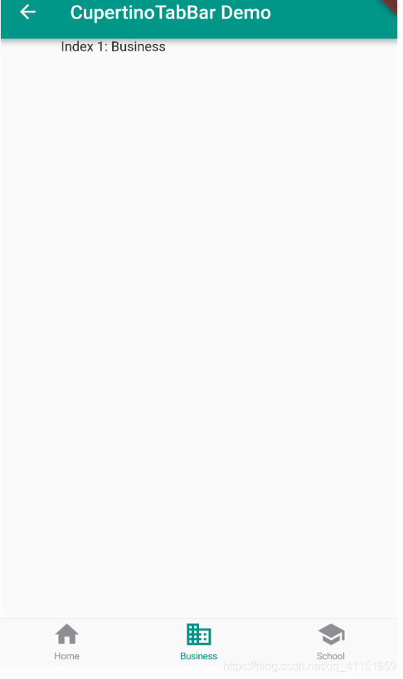
接下来我们通过代码来实现上面的 CupertinoTabBar 的效果:
class CupertinoTabBarState extends State<CupertinoTabBarSamples> {// 默认选中第一项int _selectedIndex = 0;var _pageController = new PageController(initialPage: 0);@overridevoid initState() {super.initState();_pageController.addListener(() { });}@overrideWidget build(BuildContext context) {return Scaffold(appBar: AppBar(title: Text('CupertinoTabBar Demo'),),// body主体内容用PageViewbody: PageView(// 监听控制类controller: _pageController,onPageChanged: _onItemTapped,children: <Widget>[Text('Index 0: Home'),Text('Index 1: Business'),Text('Index 2: School'),],),// 底部导航栏用CupertinoTabBarbottomNavigationBar: CupertinoTabBar(// 导航集合items: <BottomNavigationBarItem>[BottomNavigationBarItem(icon: Icon(Icons.home), title: Text('Home')),BottomNavigationBarItem(icon: Icon(Icons.business), title: Text('Business')),BottomNavigationBarItem(icon: Icon(Icons.school), title: Text('School')),],currentIndex: _selectedIndex,onTap: setPageViewItemSelect,),);}void _onItemTapped(int index) {setState(() {_selectedIndex = index;});}// 底部点击切换void setPageViewItemSelect(int indexSelect) {_pageController.animateToPage(indexSelect,duration: const Duration(milliseconds: 300), curve: Curves.ease);}}
4.BottomAppBar Widget
实现底部的导航效果,除了上面讲到的这些组件外,还可以用 BottomAppBar 来实现,这个组件自定义功能更加强大一些,也可以实现比较复杂的自定义效果。一般搭配 FloatingActionButton 自定义使用。
BottomAppBar 继承自 StatefulWidget。
我们看下 BottoAppBar 自定义实现的效果图:
我们看下 BottomAppBar 的构造方法:
const BottomAppBar({Key key,// 颜色this.color,this.elevation,// 设置底栏的形状this.shape,this.clipBehavior = Clip.none,this.notchMargin = 4.0,// 可以放置各种类型的Widget,自定义性更强this.child,})
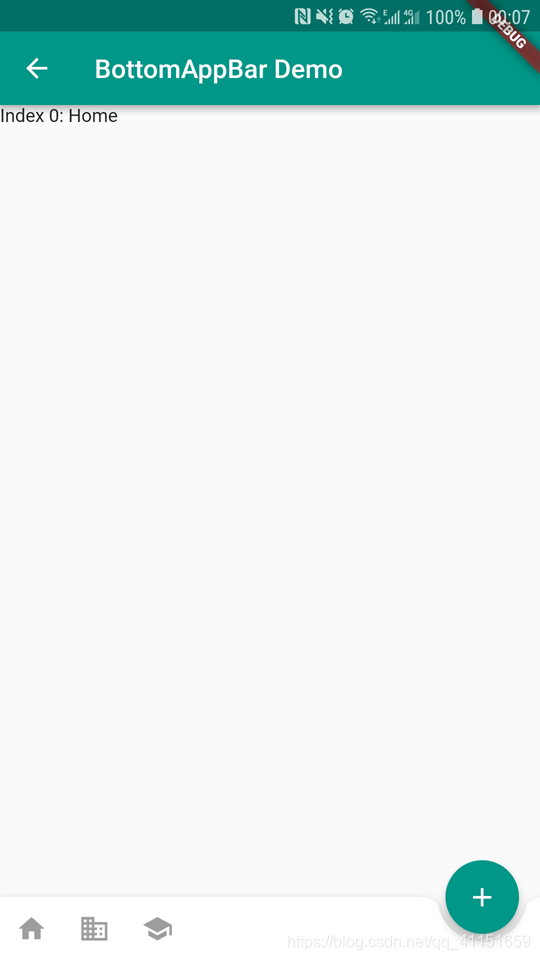
接下来我们通过代码来实现上面的 BottomAppBar 的效果:
class BottomAppBarState extends State<BottomAppBarSamples> {@overridevoid initState() {super.initState();}@overrideWidget build(BuildContext context) {return Scaffold(appBar: AppBar(title: Text('BottomAppBar Demo'),),// body主体内容body: Text("Index 0:Home"),// 底部导航栏用BottomAppBarbottomNavigationBar: BottomAppBar(// 切口的距离notchMargin: 6,// 底部留出空缺shape: CircularNotchedRectangle(),child: Row(children: <Widget>[IconButton(icon: Icon(Icons.home),onPressed: null,),IconButton(icon: Icon(Icons.business),onPressed: null,),IconButton(icon: Icon(Icons.school),onPressed: null,),],),),floatingActionButton: FloatingActionButton(child: Icon(Icons.add,color: Colors.white,),onPressed: null),floatingActionButtonLocation: FloatingActionButtonLocation.endDocked,);}}
运行效果如上面的效果图所示。
5.总结
本节博客主要是给大家讲解了 Flutter 的几种实现导航页效果的组件,我们可以根据实际情况需要选择合适的组件进行实现导航页效果,也要知道它们的用法和特点。主要注意点和建议如下:
- 掌握这几种导航页实现的方法、组件特点。
- 熟练掌握它们的用法,实践一下这几个 Widget 使用方法,尝试写一个可以有顶部和底部导航栏的页面。


 秒速五厘米
秒速五厘米 今天药忘吃喽~
 分手后的思念是犯贱
 港控/mmm°
 爱被打了一巴掌
 ╰+攻爆jí腚メ
")


还没有评论,来说两句吧...